 CELUM Experience dashboard
On this page you can learn about the layout of the CELUM Experience user interface that has three major parts:
The system bar located on the left side of the screen offers additional functions.
 CELUM Experience dashboard
The CELUM Experience
dashboard provides an overview of your active and inactive Portals.
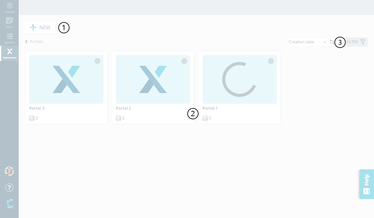
Parts of the dashboard:
NEW button: Used for creating a new Portal.
Portal cards section: All of your created active and inactive Portals will be displayed here. Those that have been last edited or newly created are automatically sorted to the beginning of the list.
Sort, search and filter: These options help you to organise Portals on the dashboard, and provide search and filtering functions.
The sort menu: Provides 4 options
to organise your Portals
on the dashboard.
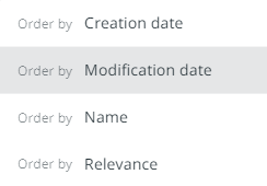
Order by relevance
When you pick this option the Portals will be sorted based on the following three factors combined:
1st Priority: Active state (active before inactive Portals)
2nd Priority: Published state (published before unpublished Portals.)
3rd Priority: Creation date (most recently created Portals rank higher up)
Sort order button: This button
 allows you to arrange the Portals in ascending
or descending order based on the sorting option you selected.
allows you to arrange the Portals in ascending
or descending order based on the sorting option you selected.
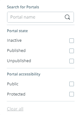
Search and filter menu: Enables
you to search for specific Portals via the search bar and/or filter
them on the dashboard based on "Portal
state" and "Portal
accessibility" options.
The Portal cards represent and display useful information about the individual Portals on the dashboard.

Parts of the portal card:
Portal publish status: Indicates wether the Portal is in a "published" or "unpublished" state.
Portal name: The name of the Portal.
Asset counter: Shows you how many assets are in the Portal.
Experience icon: Indicates that the Portal has been updated with all assets from the Library. For more information, see Connection between Portals and Libraries.
Portal wizardThe Portal wizard is the interface handling the creation and configuration of Portals.
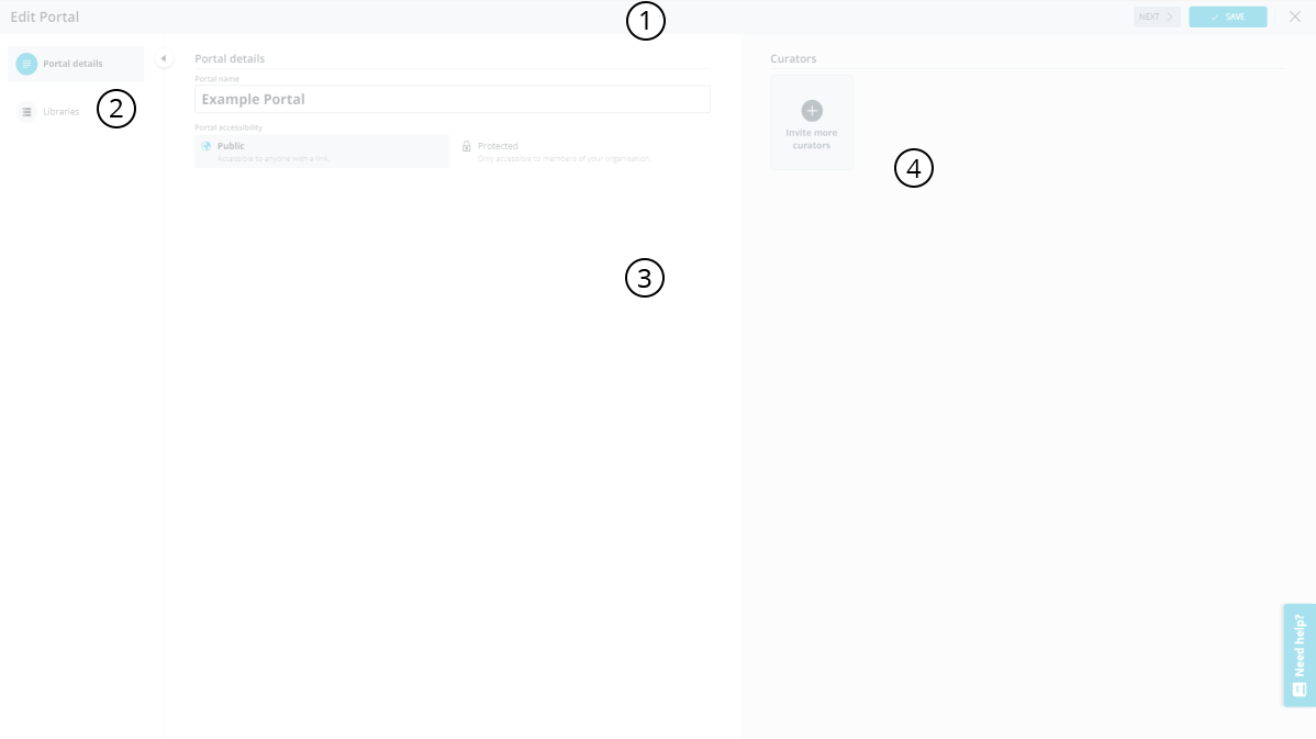
Header: Contains the navigation and function buttons.
Navigation menu: Here you can see and navigate through the tabs.
Configuration area: Here you can see available Portal settings. The settings presented here will vary depending on wether you are on the "Portal details" or "Libraries" tab.
Curator panel: Here you can invite curators to help with editing and designing the Portal. The avatars of all invited curators will also be displayed here. Your own avatar is only displayed after you add more curators besides yourself.
Portal designerThe Portal designer
is the interface handling the designing and configuration of Portals.
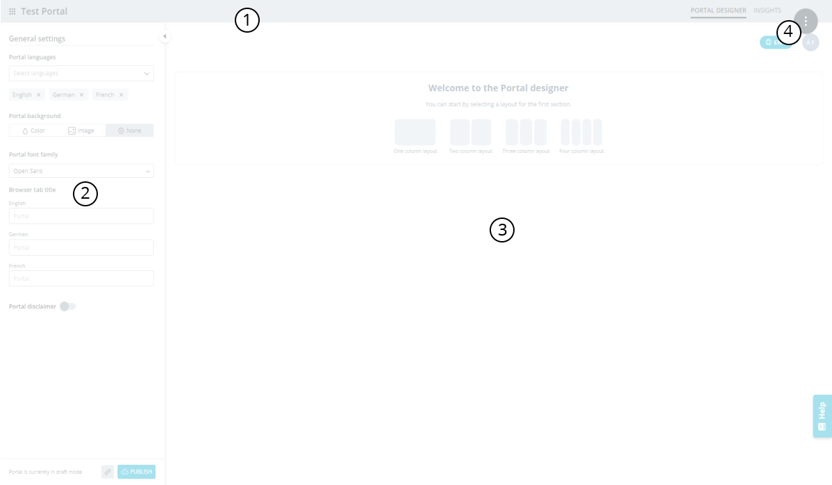
Header: Displays the name of your
Portal
and a navigation button  . The navigation
button leads back to the dashboard. You can also find the "Asset"
and "Insights" tabs here.
. The navigation
button leads back to the dashboard. You can also find the "Asset"
and "Insights" tabs here.
Design panel: By default, the general settings are displayed here. The settings will change depending on which part of the Portal you are editing or designing. The design panel can be hidden so you can have a better view on the Portal preview.
Portal preview: The platform for designing the layout of your Portal. Displays a working preview of your Portal that enables you to see the design decisions you made and test the settings you configure on your Portal before you publish it.
Magic button: Opens the magic menu where you can access different actions related to your Portal.
The asset explorer provides you with a structured way to search and find the assets you are looking for.
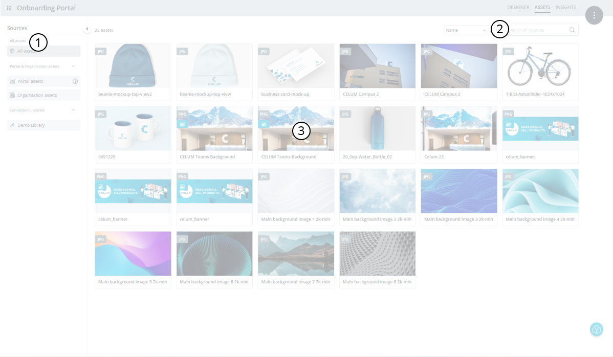
The asset explorer consists of the following parts:
Sources panel: Enables you to browse the different sources of assets available to your Portal.
Content bar: Enables you to quickly sort the asset list and find the assets you are looking for.
Asset list: Lists all the assets in the currently selected source.
The insights page provides useful information about your Portal.
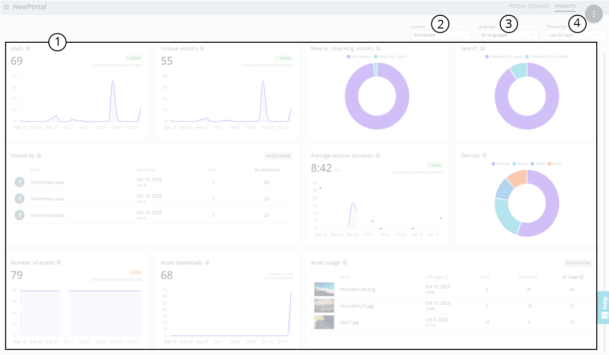
The insights page consists of the following parts:
Widgets: The 10 charts providing you with insights on the user behaviour on your Portal.
Location chooser: Allows you to filter the scope of the chart data based on the visitors' country of origin.
Language chooser: Allows you to filter the scope of the chart data based on the Portal languages available for the visitors of your Portal.
Time frame chooser: Allows you to filter the scope of user data by showing results within a given time period.
This information is useful for the following topics:
System barThe system bar is located on the left side of the browser window. You can access it from anywhere in the application. It contains the following functions:
Buttons to access other CELUM services in the CELUM Cloud.
Bell icon to access the notification centre.
Your user settings (accessible via your avatar), which allow you to switch the application language, manage your account, organization administration, and log out.
The Help menu
The CELUM logo
Switching
languagesTo switch the application language, click on your user avatar in the system bar and open the user settings.
There, you will find a drop-down menu from which you can select a different language.